MTS Bank was hit by sanctions, so it obtained a new license and launched a new brand — MTS Dengi (“MTS Money”). The task: build a platform for the new product.
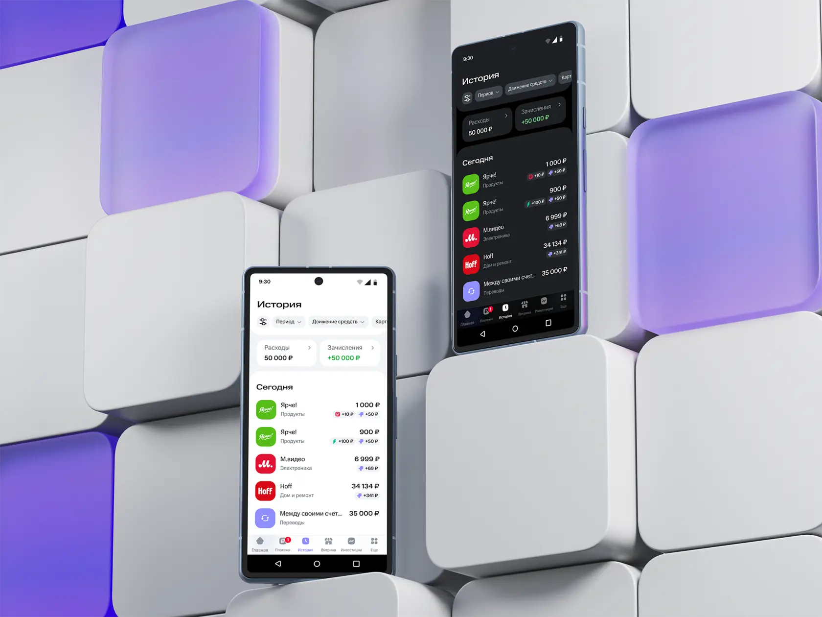
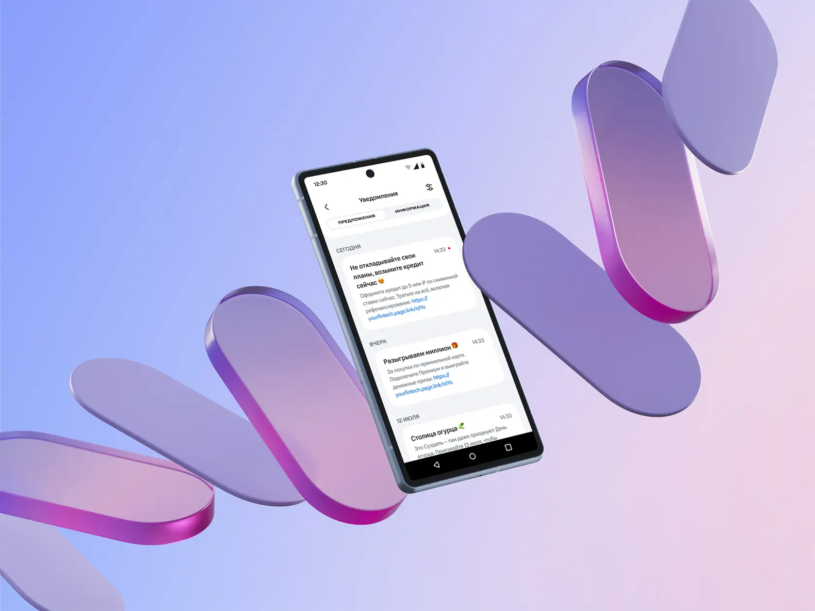
Push notifications and transaction history
Every release was a struggle: interfaces were visually falling apart, screens of the same product looked different from one another, and developers had to fill in the details on their own. Product design as a discipline simply didn’t exist. The first order of business was basic product “hygiene.” Luckily, strong people joined the team along with me, so we had fertile ground to work with.
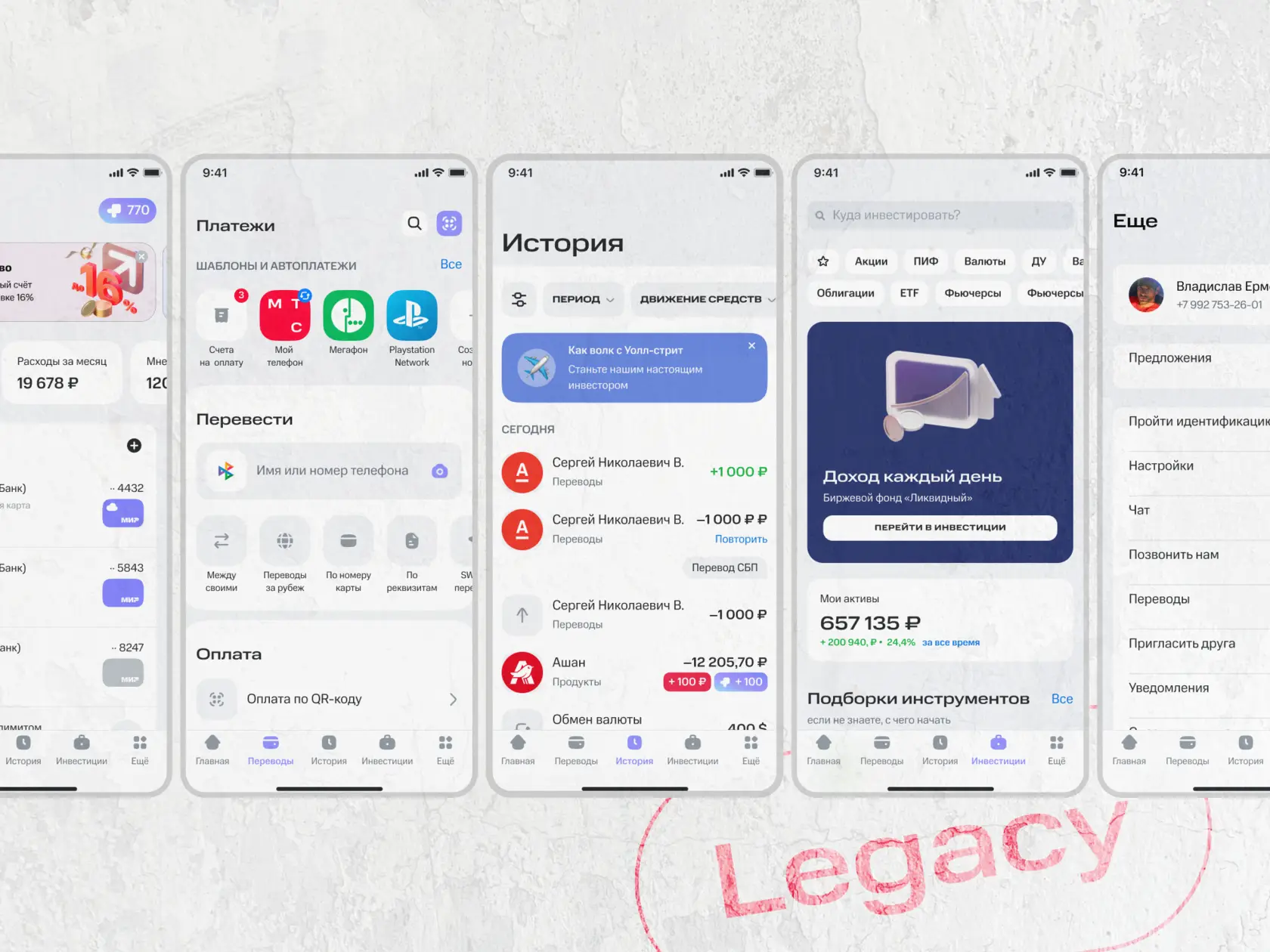
The starting point
The first impulse was to redo everything from scratch. But the reasons the product had ended up the way it was hadn’t gone anywhere. So we started by forming a clear picture of the result we wanted and moved toward it gradually, step by step.
Design lead on the project
I became the link between management and engineering, piecing together the reasons the product was built the way it was. That let me put forward a realistic plan to bring the product up to market-level quality and make our processes predictable.
No micromanagement
Thanks to this plan, the product manager didn’t impose solutions but adjusted course based on the team’s needs and agreements. We held on to the core design direction. And that gave me the most valuable thing of all — time to actually think about the design.
Buy-in
I earned the trust of the specialists on the team. Now they come to me directly with questions, bypassing the managers, which speeds things up considerably. Developers aren’t shy about taking initiative and are becoming true co-authors.
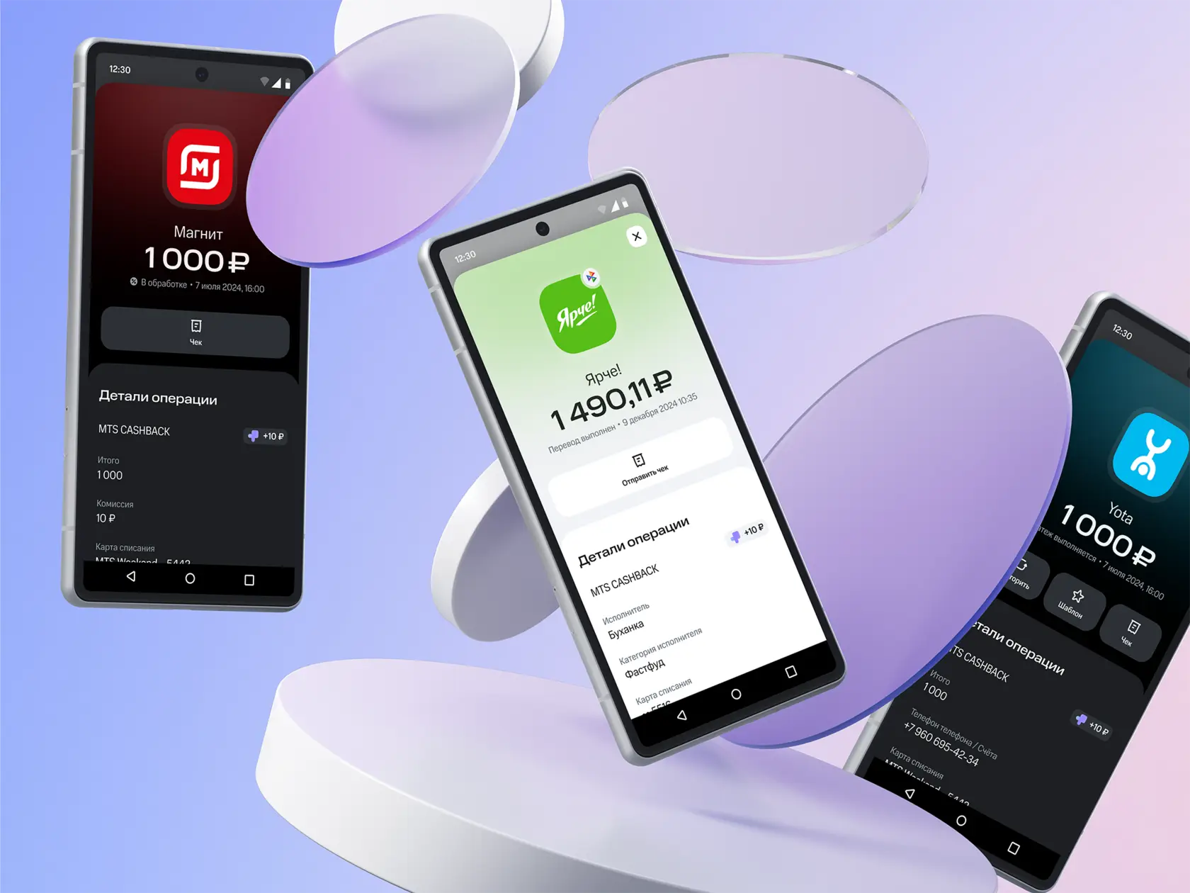
Design system
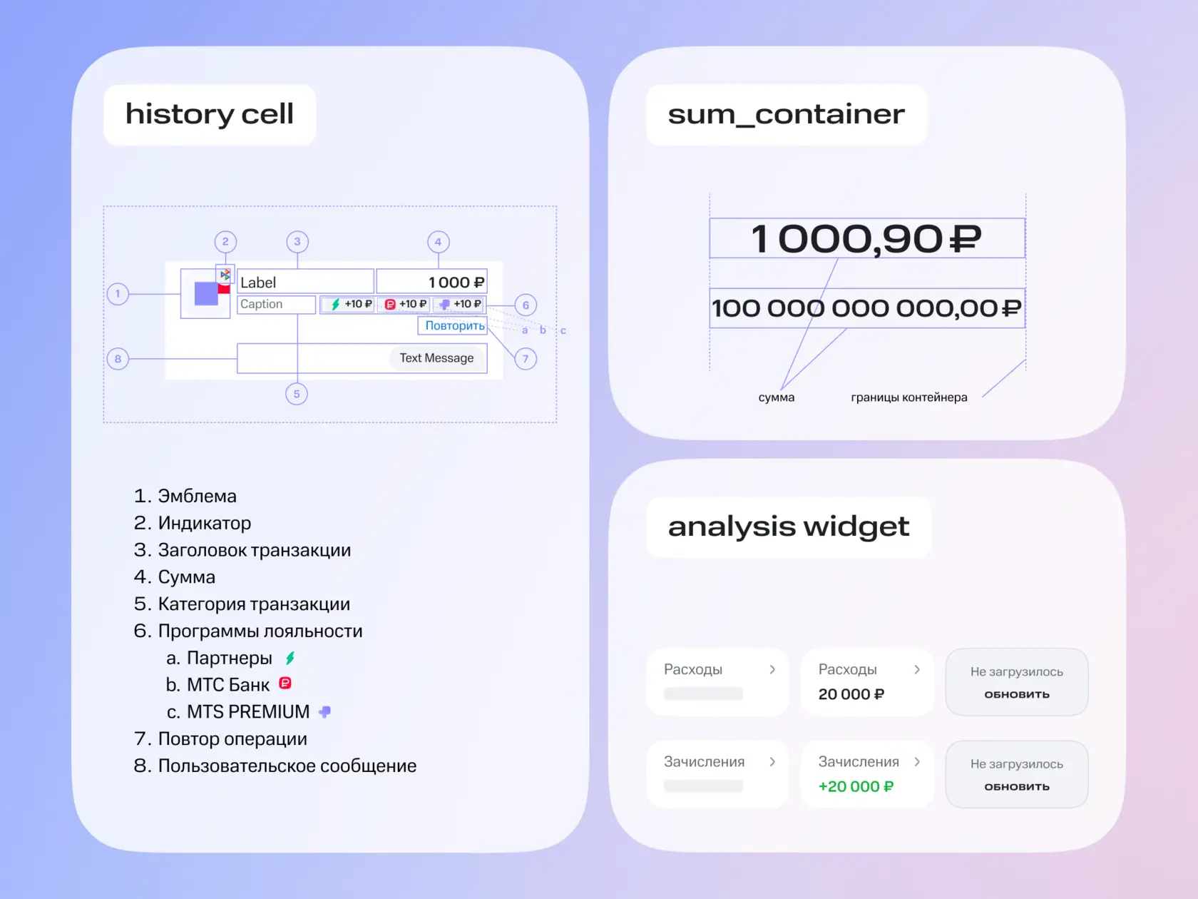
The design system team covered most of our needs, but sometimes the components we needed just weren’t there. When the design system was upgraded to Fintech 2.0 (a fork of the MTS group’s Granat), it became obvious that the Transaction History product barely used system components. Some elements had been detached from the design system, and others weren’t used at all. So we rebuilt all of our products on the updated design system and, where needed, contributed to it via InnerSource.
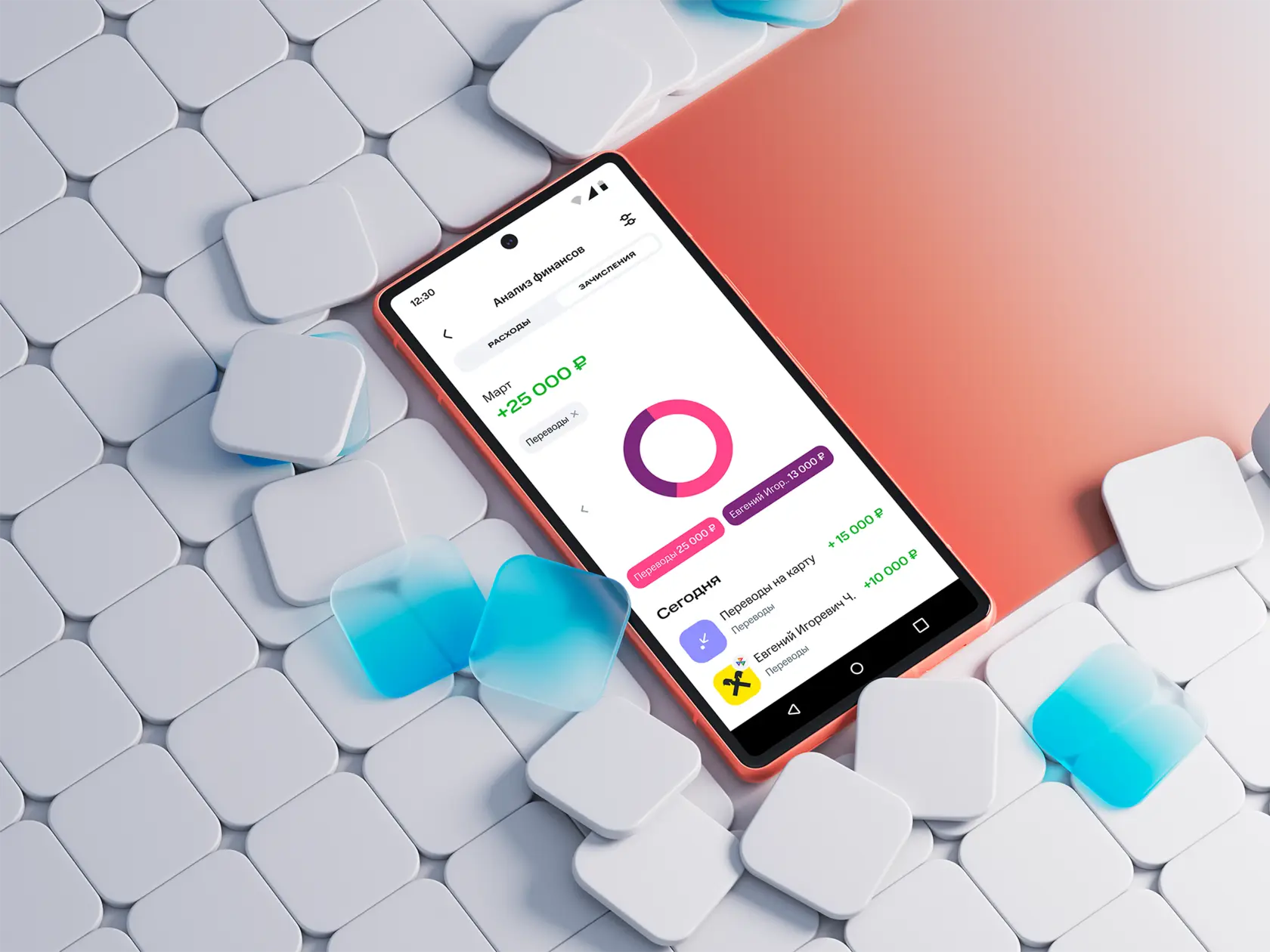
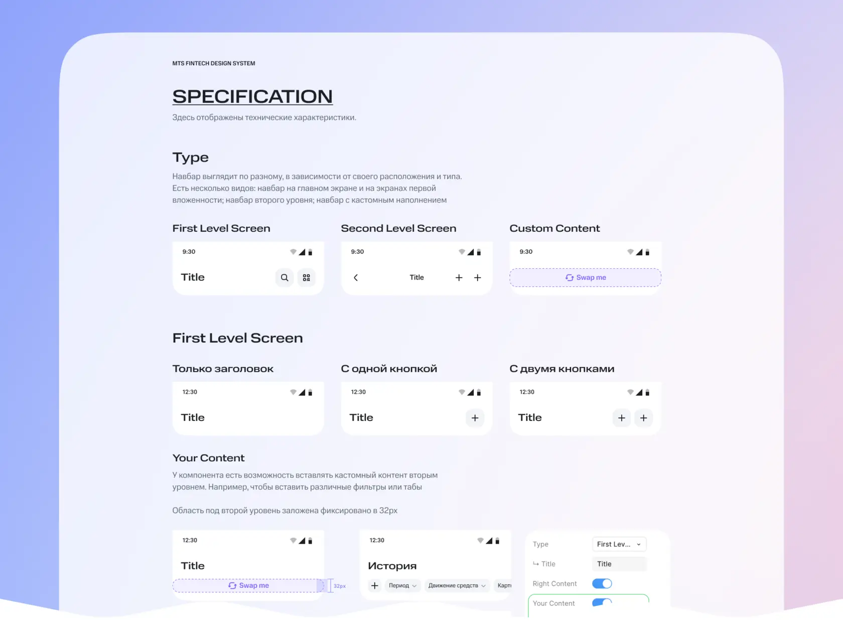
Full design-system coverage of our tasks drastically cut the number of iterations — because, as you know, getting sign-off sometimes takes as long as the work itself.
Logos
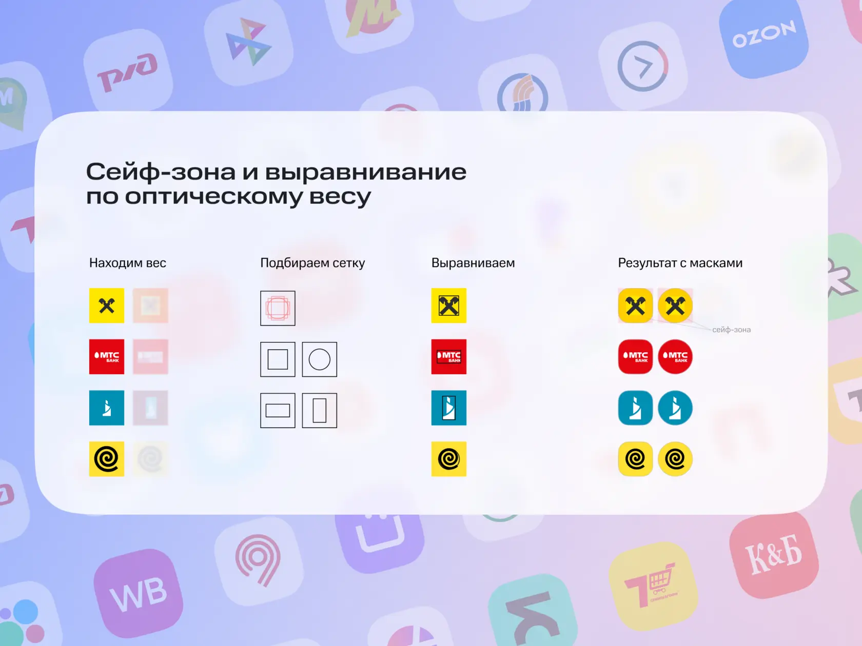
Logos were a problem of their own: many companies didn’t have one at all, and the ones we did have were raster images cropped into circles. When placed in the new design system’s square container, they left “ears” sticking out in the corners. So we had to roll up our sleeves: prepare a couple hundred logos, convert them to vector, and write guidelines for new designers.
What’s next…
Unfortunately, I didn’t get to see the product’s transformation all the way through — the company started ruthlessly cutting costs. I left the project, but I hope the concepts and principles I laid down will help the team stay on course and keep moving toward a mature product.
Navigation
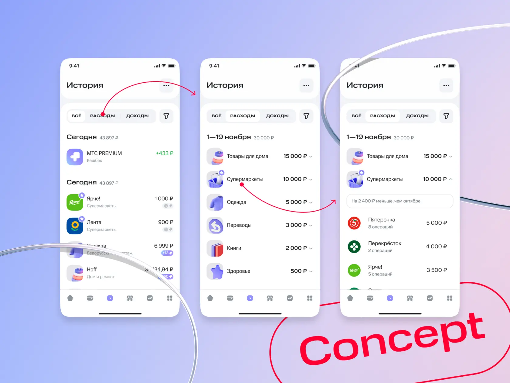
Splitting the experience into two contexts, day-to-day and long-term money management, plus gesture controls.
Banners + push notifications
It feels like it’s time to take the final step and merge promotional tools and push notifications into a single, unified communication channel.
Navigation
Splitting the experience into two contexts, day-to-day and long-term money management, plus gesture controls
Banners + push notifications
It feels like it’s time to take the final step and merge promotional tools and push notifications into a single, unified communication channel